
Picture This: Deep Thoughts
In the latest Picture This column, Nicolette Jones digs deep.
Shirley Hughes once talked to me about depth in children’s illustration. She was a great admirer of Edward Ardizzone because you could ‘walk into’ his pictures in your imagination. Each was a scene that beckoned you to enter. She thought there were two directions to think about in the making of a picturebook. One was the direction through the book as you turned the pages, showing the development of the story, and sometimes including the movement of characters across a page and on to the next. The other was the direction into the book through each image so the reader had the feeling of going behind the surface, as if climbing out of the stalls onto a stage, or stepping through the wardrobe into Narnia.
The three pictures I want to look at today show different ways of creating depth. We tend to expect depth to depend on perspective and a detailed setting, and we think of a simple graphic style as the flattest kind of picture – one in which colour is in uniform blocks, there is no shading, no vanishing point and no backdrop but white space or another flat colour.
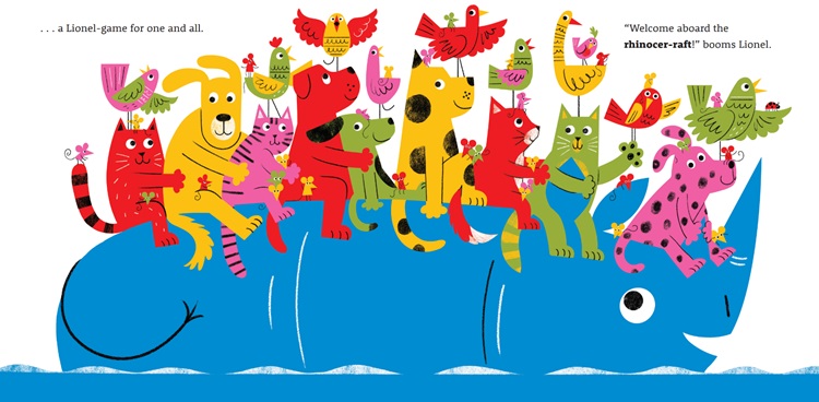 An example of this might be the image I chose from Lou Cole’s picturebook Lionel (Rocket Bird Books) in which a parade of animals rides on the back of a rhinoceros. The colour is completely flat, the background is white, and nothing seems to stretch away from us. This bears no resemblance at all to an Ardizzone interior, nor to Shirley Hughes leading you round the playground at the school fete in Dogger. The movement is all from left to right as the ‘rhinoce-raft’ carries other creatures along a river.
And yet there is a certain implied depth even in the use of this flat technique. The image plays a trick in the mind of the viewer because we cannot shrug off our knowledge that rhinoceroses are bulky. The picture represents something we know to have depth. We don’t perceive the rhinoceros as two-dimensional. This is helped along by a few curved marks meant to suggest the rounded flank of the animal and the convex shape of its horn. But even without these hints, flatness can, weirdly, suggest depth. If we consider for instance Matisse’s cutouts of a ring of dancers, the arrangement of the figures, which are completely flat, makes us see a circle in which the dancers at the top are further away from the viewer than the dancers at the bottom. And this is true even though the dancers above are not notably smaller than those below, which would bring a shrinking perspective into play. Even a silhouette can imply volume: the edges show the curves of bodies, so we fill in the shapes and believe we see 3D people, not just paper dolls.
Lo Cole’s flat shapes, though hardly communicating depth as Shirley recommended, do show that some parts of the picture are behind others. Creatures have arms around each other. The mouse on the rhino’s left ear is certainly behind the cat who is clasping the right ear. The birds with two wings have one in front of the other. It’s just that it is the mind of the viewer that creates the depth.
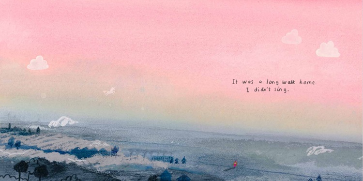 We also tend to think that simplicity precludes depth, but that is not always the case. To take another example: Emma Yarlett’s spread from Unicorn Post (Walker) seems to be little more than a few washes of colour. But close inspection shows us something quite different: the horizon is very far from us indeed. Here, it is scale that creates the distance. A tiny red figure – the protagonist – seems lost in a vast landscape. We see a minute viaduct, which we know to be a massive structure, and therefore it turns the rest of the view into a huge expanse. There is also some use of perspective because the trees in the foreground, though small, are somewhat larger than the trees on the next plane of the vista. White furrows in a field point towards the horizon. And low white squirls of clouds suggest that there is not only distance but height in this panorama. And the shading of the colours to the skyline also invokes distance, The turning of the page has taken us into an epic scene. And, along with the protagonist, we have a long way to go. (Meanwhile the unicorn is flying in the air in the middle distance.)
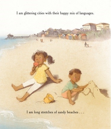
It turns out that Emma Yarlett’s picture has something in common with a more traditional depiction of a far-reaching setting such as  Ruchi Mhasane’s image of two children on a beach from This is Who I Am (Andersen Press). The lone and level sands stretch far away, the effect achieved by the accepted device of larger figures in the foreground and much smaller ones which are further from us. The smaller the distant figures, the longer we understand the beach to be.
But having thought about depth in the other illustrations, we realise that this more conventional approach also uses a trick of the mind. The empty space above the heads of the children resolves itself into a long stretch of sandy beach when it is in fact painted on a flat sheet of paper (or screen). The plane which is the surface on which the picture is made, which is like a mirror we are looking into, tips to extend away from us, like a table top. Simply by virtue of placing tiny figures, small beach huts and a miniature pier in the top half of the illustration. The effect of depth in a two-dimensional work of art is always a kind of magic.
No wonder Shirley Hughes admired it. Just as words can turn little black marks into pictures in our heads, so pictures ask the brain to be creative in many ways. Making us perceive a third dimension is just one of them.
Nicolette Jones writes about children’s books for the Sunday Times and is the author of The Illustrators: Raymond Briggs (Thames & Hudson); The American Art Tapes: Voices of Twentieth Century Art (Tate Publishing) and Writes of Passage: Words to Read Before You Turn 13 (Nosy Crow).
Books mentioned:
Lionel (Rocket Bird Books), Lo Cole, 978-1915395269, £7.99 pbk
Unicorn Post, Emma Yarlett, Walker Books, 978-1529525175, £12.99 hbk
This is Who I Am, Rashmi Sirdeshpande, illus Ruchi Mhasane, Andersen Press, 978-1839135774, £12.99 hbk


