This article is in the Windows into Illustration Category
Windows into Illustration: Harry Woodgate
Harry Woodgate combines rainbow colour palettes with carefully crafted textures to produce illustrations that are characterised by warmth and a sense of inclusiveness. Their books include Grandad’s Camper, Little Glow and Shine Like the Stars. In this article, they describe the illustrative process for Timid, the story of two young performers.
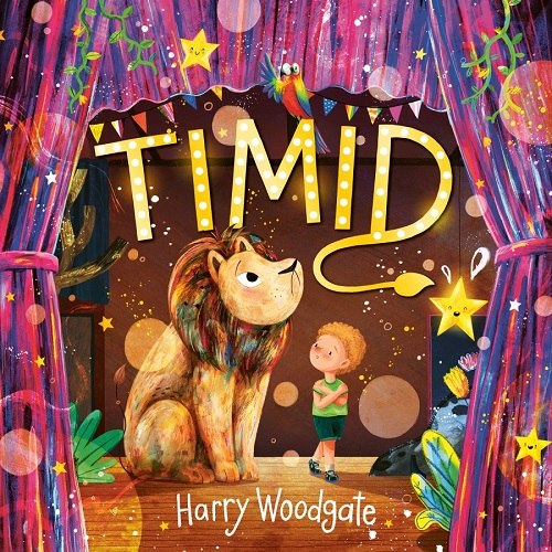
 In my latest picture book Timid, Timmy loves performing, but only when there isn’t an audience, and they constantly live in the shadow of their inner cowardly lion. So, together with classmate Nia, they set out to tame the pesky feline in time to take part in the school play.
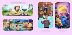
In the spread I’ve chosen for this article, Timmy and Nia are trying different methods of addressing their shyness, including mindfulness, positive affirmations, and reframing worst-case scenarios. I’ve struggled with anxiety for most of my life, so it was important to me that this book began a conversation for young readers and caregivers about how to manage it in healthy and sustainable ways. One big thing I’ve learned is that it doesn’t just ‘go away’, so I wanted to express this through the lion’s continuous presence throughout the book, and instead bring the focus towards learning to live alongside your worries.
Characterisation was a big part of this book and the illustrative process. Nia is creative and enthusiastic, which comes across through her bright outfits and expressive gestures. She’s willing to jump straight in, whereas Timmy is a little more earnest and hesitant – in the top left illustration we see them focusing more intently, and below, they begin to relax and have fun when Nia takes the lead.
Mr Stevens is another important presence – I wanted him to feel warm and reassuring, gently guiding Timmy and Nia whilst allowing them to take ownership of their emotions and discover things independently, in the way that all good teachers do. Everything down to his cosy jumper and mug of tea was illustrated to help achieve this!
Finally, the lion functions as a visual mirror or shadow, reflecting and amplifying Timmy’s emotions. Whilst we gain a certain level of  understanding from Timmy’s expressions and posture alone, the lion and surrounding illustrations help reinforce these readings. For example, on this spread, the lion first appears irritated and alert, then calmer but still inquisitive, until finally it curls up asleep on Timmy’s bed, reflecting how Timmy is beginning to feel more in control of their anxiety. Throughout the book, the lion’s technicolour mane suggests that whilst it is flighty and anxious, perhaps there’s an inner confidence waiting to break free.
I illustrated Timid using a combination of digital and traditional techniques. To me, there’s something really appealing about organic, hand-drawn textures and mark-making in picture books; they bring a tactility, spontaneity, and relatability which helps engage young readers, so I thought a lot about how to incorporate these in meaningful ways. Together with the colour scheme of yellows, pinks, purples and blues, which also references the non-binary pride flag, they help establish different emotions and guide the reader through the story, whilst building a world that feels immersive and three-dimensional.
Timid is published by Little Tiger, 978-1838915117, £7.99 pbk.


