A Q&A Interview with Padmacandra
Padmacandra was shortlisted for the 2022 Klaus Flugge Prize as illustrator of The Tale of the Whale. Her new book, Don’t Be Silly, explores the importance of play and laughter. Padmacandra answered our questions on the book.
Describe Don’t Be Silly for us – how did the idea come about?
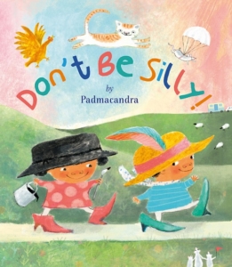
 Don’t Be Silly is essentially a drama that contrasts two different ways of being in the world in a comic way: bouncy playful silliness contrasted with stiff distracted seriousness. I’ve always loved the unique opportunity that picture books can have to create ‘moments’ of rapport between adults and children. Like a poem, picture books can evoke a timeless moment of being present together, and rhythm can be part of that evocation. So I knew I wanted to create a book that was interactive in this way, and was good to read aloud or together. I wanted the book to be fun for both children and adults to read, and wanted there to be plenty to look at in the book for little eyes to notice. Hence the galleries and the various creatures – including mice – that inhabit the pages.
There is also a kind of lively sparring between the child view and the grown up view, giving the child view validity and potency, and I wanted the ending to be a bit ambiguous rather than predictable with a kind of swapping of roles (although the final spread resolves this wordlessly).
Various things came together to first produce this text (several years ago!). Firstly, I was about to attend a week’s summer school in children’s book illustration at the Cambridge School of Art and they had asked us to bring a text of 500 words. At the same time, I was doodling characters and a rather haphazard roly-poly looking couple of babies appeared, who looked a bit acrobatic and eccentric.
I had a thought about the round bounciness of these children contrasted with the potential tall dry sternness of grown-ups, and it tallied with a thought I’d had looking at lambs playing in a field with their sheep mums: at what point do sheep lose their bounciness?
A kind of bouncy rhythm began in my head, paired with the repeating phrase ‘Don’t Be Silly’, and the rest came quite quickly. And in the background, I was likely influenced by a love of nonsense poetry by people like Edward Lear and Hilaire Belloc … the book has I hope a rather traditional feel in this sense. The setting of a castle and all the pomposity that such a setting could provide probably was influenced by this.
I also wanted the book to be a real story with a beginning, a middle and an end. (I’m sorry to say that not all picture books have a satisfying storyline, even if they can be beautiful or intriguing in other ways).
There’s a lovely meeting of generations in the story – with (spoiler) old people taking younger ones by surprise. Is that something important to you?
I work part time as a carer for older people and have always had an interest in the fact in the latter part of life, as well as at the start, there can be the privilege and opportunity of meeting people without any sort of social ‘mask’ on.
There can be a very pure and lovely encounter with something essential and authentic that is there in all of us, but often hidden by the concerns and exigencies of life. I’ve always been more interested in this essential more spontaneous part of people (something that can also be ‘cultivated’ through the practice of mindfulness). So yes, this value is important to me, and must have influenced the book.
Also, grandparents are actually much younger seeming and more active these days than they might have been in the past, so there is a stereotype of the frail elderly to be challenged there.
And having witnessed my own parents with their grandchildren, there is the potential for it to be a unique and precious relationship, that needs celebrating in itself.
This is your second book, but you’ve said it was the first book you took to your publisher Scallywag Press. How has it developed since then?
The book has had plenty of time to develop as it first emerged at a Summer School before I even decided to attend the MA at the Cambridge School of Art. There were several people who supported the project and their comments made a difference. Firstly the designer Ness Wood was at the Summer School and particularly encouraged the project. A couple of things in the original changed as a result of her feedback. The original name of one of the characters was Roly-Poly Podge but Ness reminded me that childhood obesity was a sensitive subject. Similarly, the grandparents originally lived in a large house, and as a result of talking with Ness I realised that this was a little exclusive. Secondly the project became my Masters project on the MA. Martin Salisbury of the Cambridge Schol of Art championed it after graduation, giving me both confidence, and a few pointers on the illustrations.
I worked closely with Janice Thomson of Scallywag Press on the text, Sarah Pakenham the publisher also came in with some timely comments. Originally the grandparents lived in Hull and were rather ‘dull’, but of course this is a very UK centric joke! Also there was a lovely bit (I think) that we had to drop for obvious health and safety/ rights reasons. This was where the two children cut the bristles off a brush, and stick moustaches and beards onto their faces with glue!
 In terms of the illustrations I worked with the designer Louise Millar. She made some great comments and pushed me to improve various spreads – particularly the caravan! And to work to make the characters more appealing and consistent.
Don’t Be Silly is filled with details and subplots for children to spot and follow. Is that something you planned from the beginning or did it just develop as you worked on the book?
The mice appeared very early in the dummy books. And the cat and dog were also there from the beginning. Animal (or other) characters that appear in books but are not mentioned in the words can play an important role in the narrative (as the seagull did in The Tale of the Whale). They are like the reader’s awareness through the book – or a kind of sub verbal narrator – and can suggest or indicate the kinds of unspoken reactions that might be evoked in the different stages of the story. For example, the cat looks a little apprehensive in spread two, whilst the children are merrily tumbling into the castle. The cat – like the reader – can see ahead to where Mr Judge sits getting on with his dry serious paperwork (and the football is flying perilously through the air towards the ink pot).
The mice did multiply rather, and I love it when there are surprises or things to see in a book, some of which might only be discovered after several readings. I talk more about this in the question about galleries below!
The book also features your own, wonderful versions of paintings children might discover on the walls of art galleries. Tell us about your decision to do that and what you enjoyed about it.
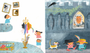
The galleries again appeared in the original sketches and book dummies. To me the images of portraits that one sees in stately homes or galleries are such a wonderful way of talking about a certain stern overblown pomposity. The portraits were a good way of representing the ‘serious’ adult view, and it includes the dynamic that portraits are often big and tall, and looking down at the viewer (especially a child viewer).
But in the dummy books the only painting I imitated was When Did You Last See Your Father (by William Frederick Yeames) as a rather sober joke on the absent distracted parent. But in the end that seemed a little too serious and pointed (as well as potentially trivialising a heart-rending painting).
Then when I was doing the final roughs, it did occur to me that is would be fun to look at actual paintings and try to imitate them. I thought it would add interest too, and even a (hopefully fun) art educational aspect!
I selected paintings rather randomly, through the art books I already had in my bookcase, and internet browsing. They are all well-known paintings though. It was such fun to do.
Some of the gallery paintings are more generic, and much more loosely based on a ‘type’ of painting or portrait often seen.
I’ve developed some great activities for schools and care givers to do with their little ones around the book. One of the more truly devastating aspects of looking at paintings in our major art galleries is the reflection it gives of the European Empire and its slave owning past. I have managed to put together a more diverse and inclusive group of example paintings for children to look at for inspiration in the activity sheets (although there is always a double edge to that in not wanting to cover up the reality of the past either).
And I will let you into a secret which I’ve not yet mentioned. And no one yet seems to have noticed. There is something in the book that relates to one of the paintings in the gallery spread – one that isn’t actually based on a real painting (although it contains typical themes). It echoes something that happens elsewhere in the book. Can you spot it?
Do you have a favourite spread or image in the book? Could you describe it for us.
There are a number of favourites, but I do love the full gallery spread. This is an early turning point in the book, where the children wonder aloud about what makes grown-ups ‘serious’.
Bo is standing on the right-hand side of the spread looking up at the serious looking portraits (which are equally looking down on him), and Smudge is wandering into the gallery on the left side of the spread, pulling a cart which is full of both art materials, and mice. One of the mice is running behind the cart to catch up.
So this spread perfectly captures in images and text the main themes of the book – contrasting two modes of being, and wondering what it means to be a grown-up, and the pictures add something extra that the words alone would not convey. Which of course is one of the magic possibilities of picture books.
Can you tell us what you are working on now?
I’m playing with a few ideas, the most concrete of which is a book about a small Japanese girl wanting to write a poem and enter a haiku competition. My idea is that through the book the girl learns some of the values or perspectives that are needed to write an authentic poem. This is a subject close to my heart.
Don’t Be Silly is published by Scallywag Press, 978-1915252111, £12.99 hbk.


